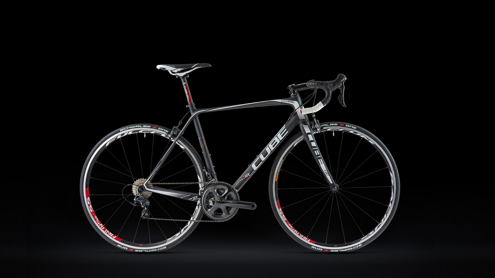
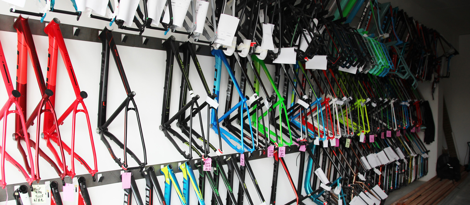
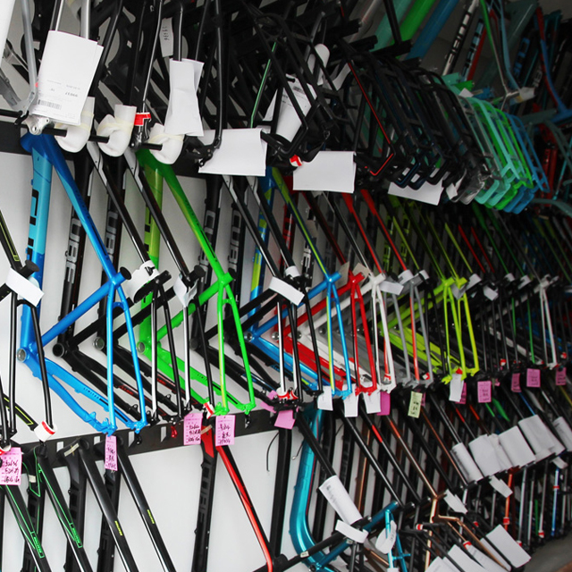
Cube Bikes Product Graphic MY 2017 – 2009.
Decal, Lacquer and Laser! Since almost 10 years we explore and invent what cycling friends like. The product graphic for the CUBE Bike Collection (www.cube.eu) is a new challenge every season. It has made us excellent specialists of bike graphics. Our aspiration for the CUBE profile is to refine a structured and cohesive product graphic backline, to match the company’s image, to meet the customer’s expectations, and to set new standards. We focus intensively on graphic and sport trends and on the target group and the product environment. We design the complete “bicycle” pack, so we don’t stop at the frame, but design attachment parts, cross-area elements, typography, and segment designations. CUBE keeps growing and we are happy about increasing sales numbers, especially in the design relevant lines – and about awards for our work!
The collections 2010-2013 resulted through a collaboration with Ute Kempter (www.utekempter.de).
Project Assistants: Barbara Wilkesmann, Phoebe Sowa, Markus Klopfer, Rebecca Hippeli
2017
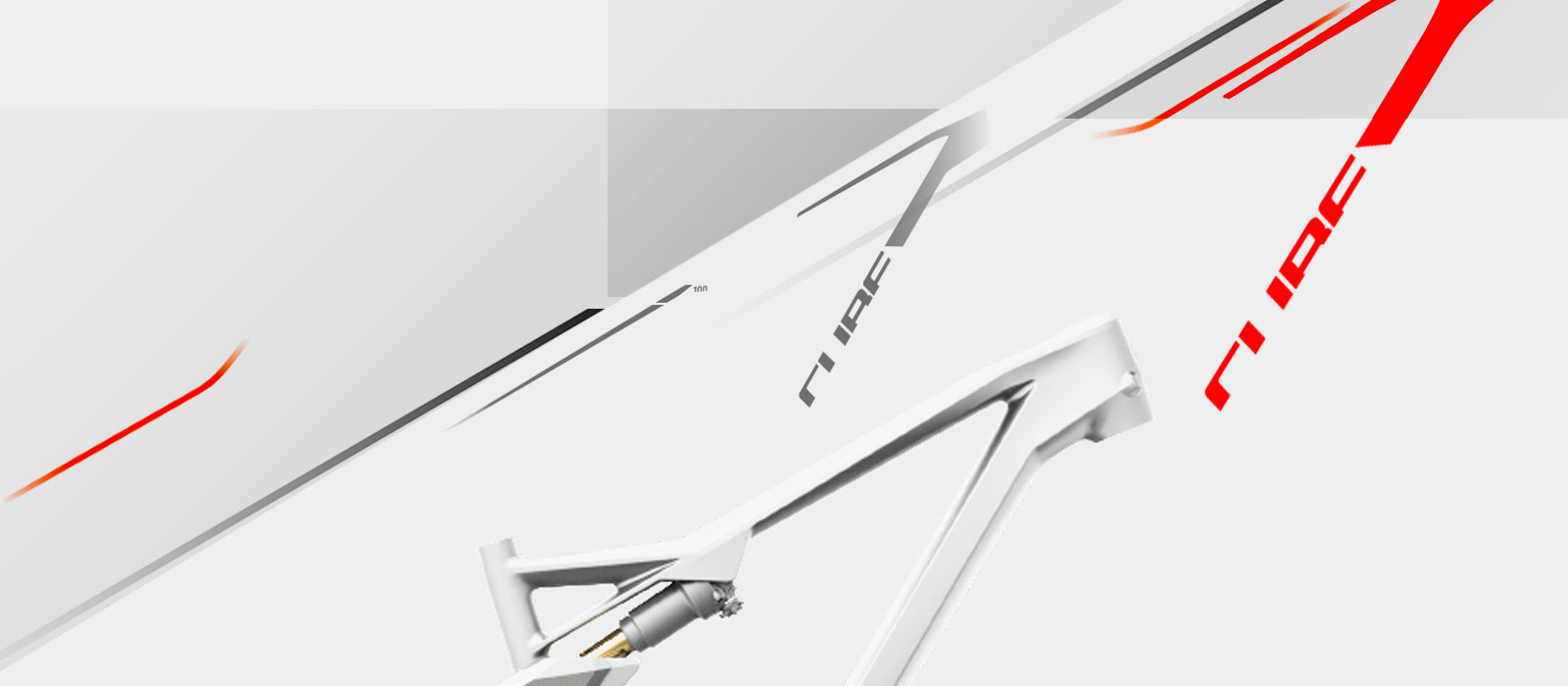


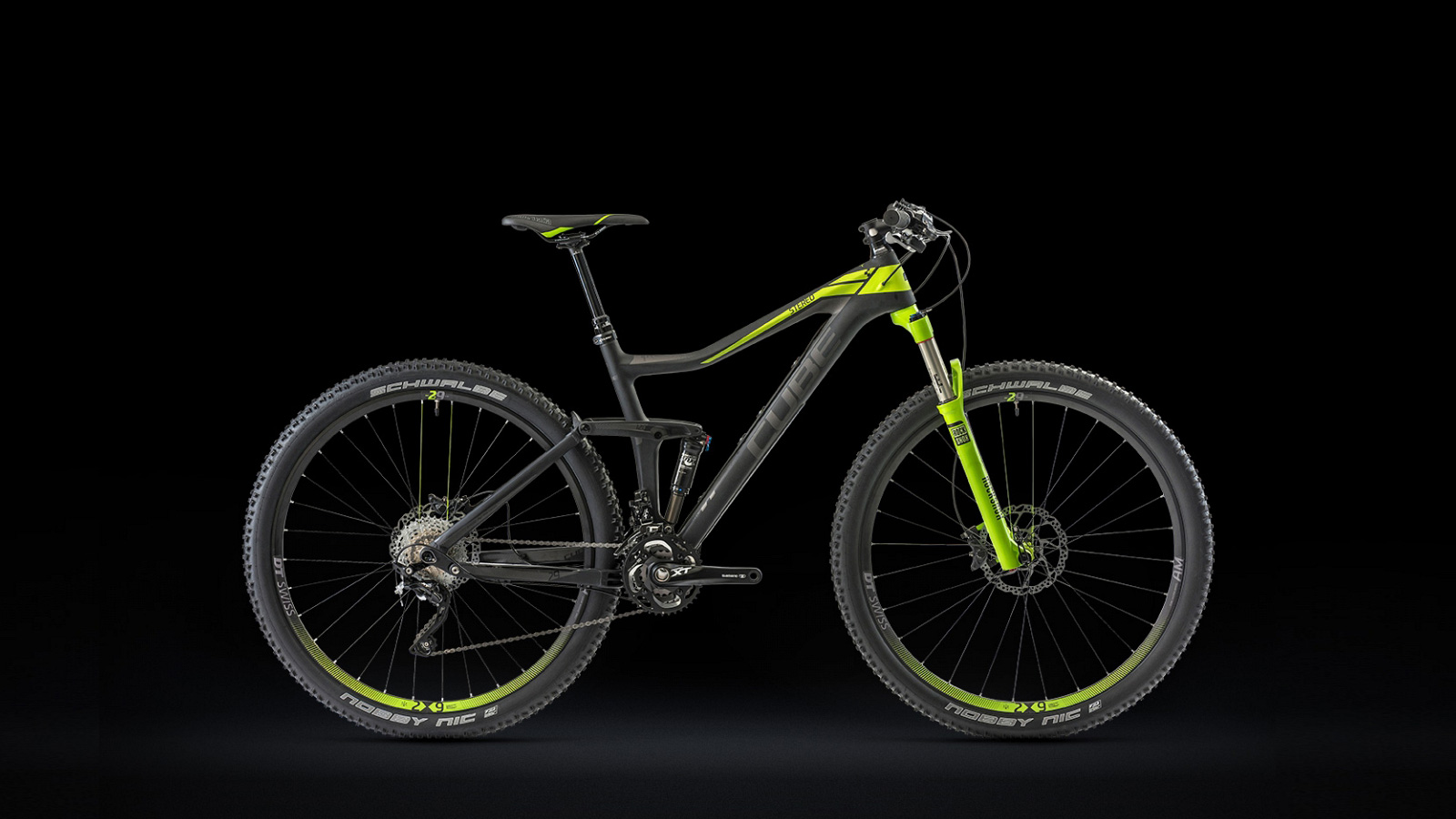
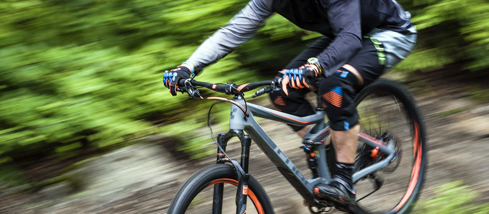
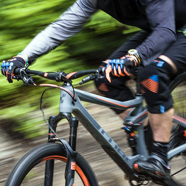
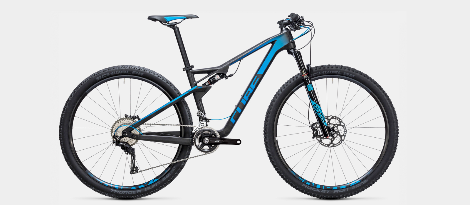
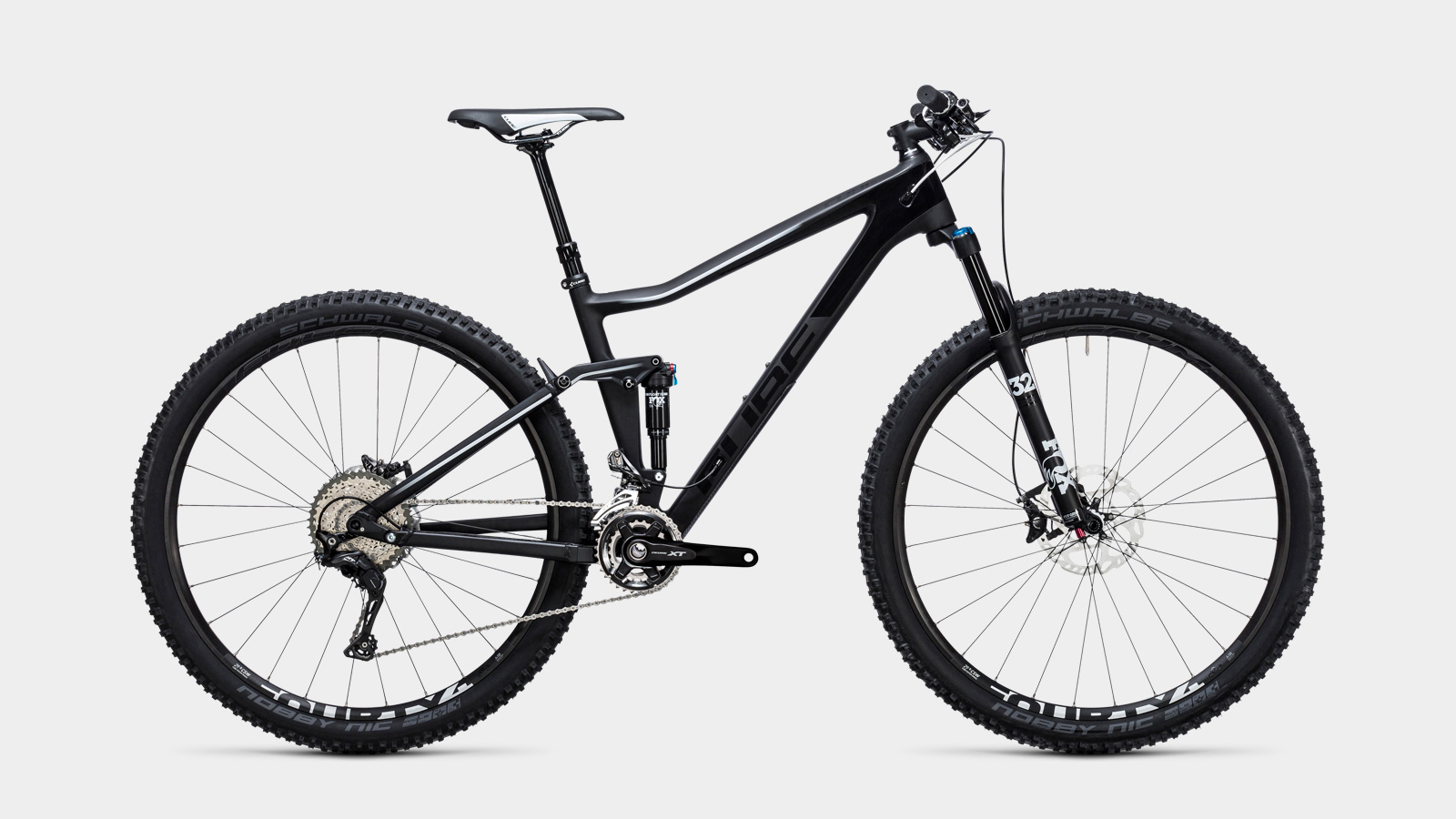
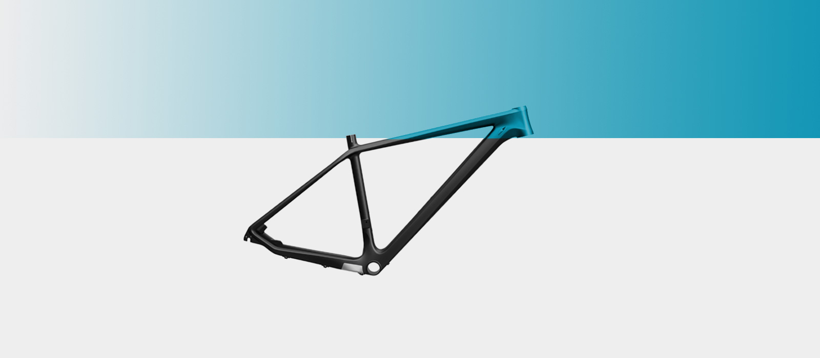
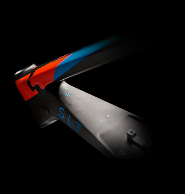
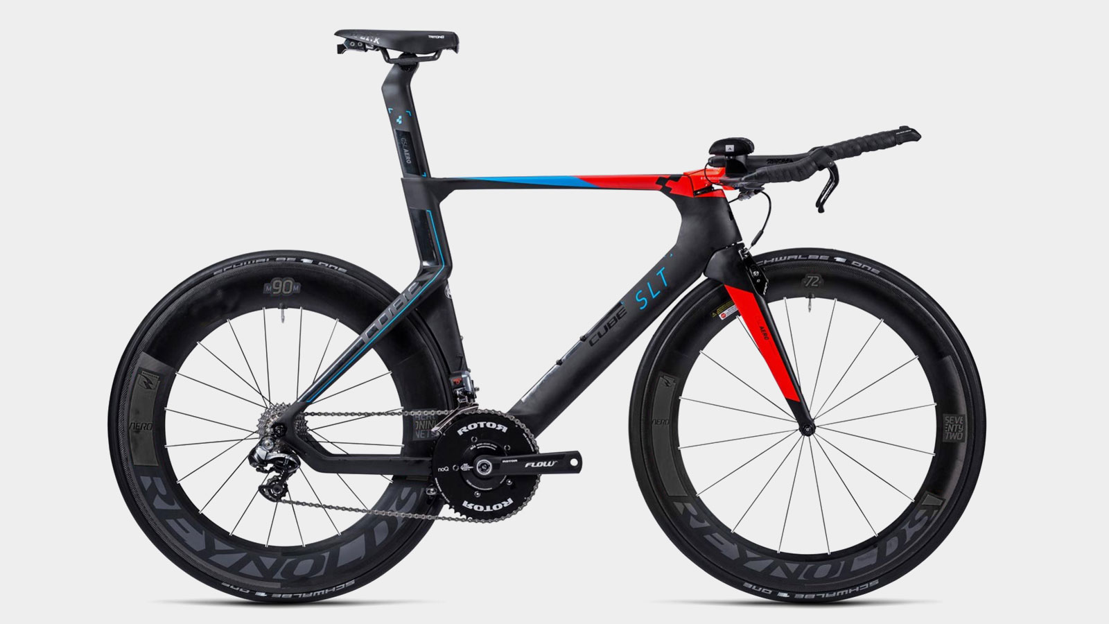
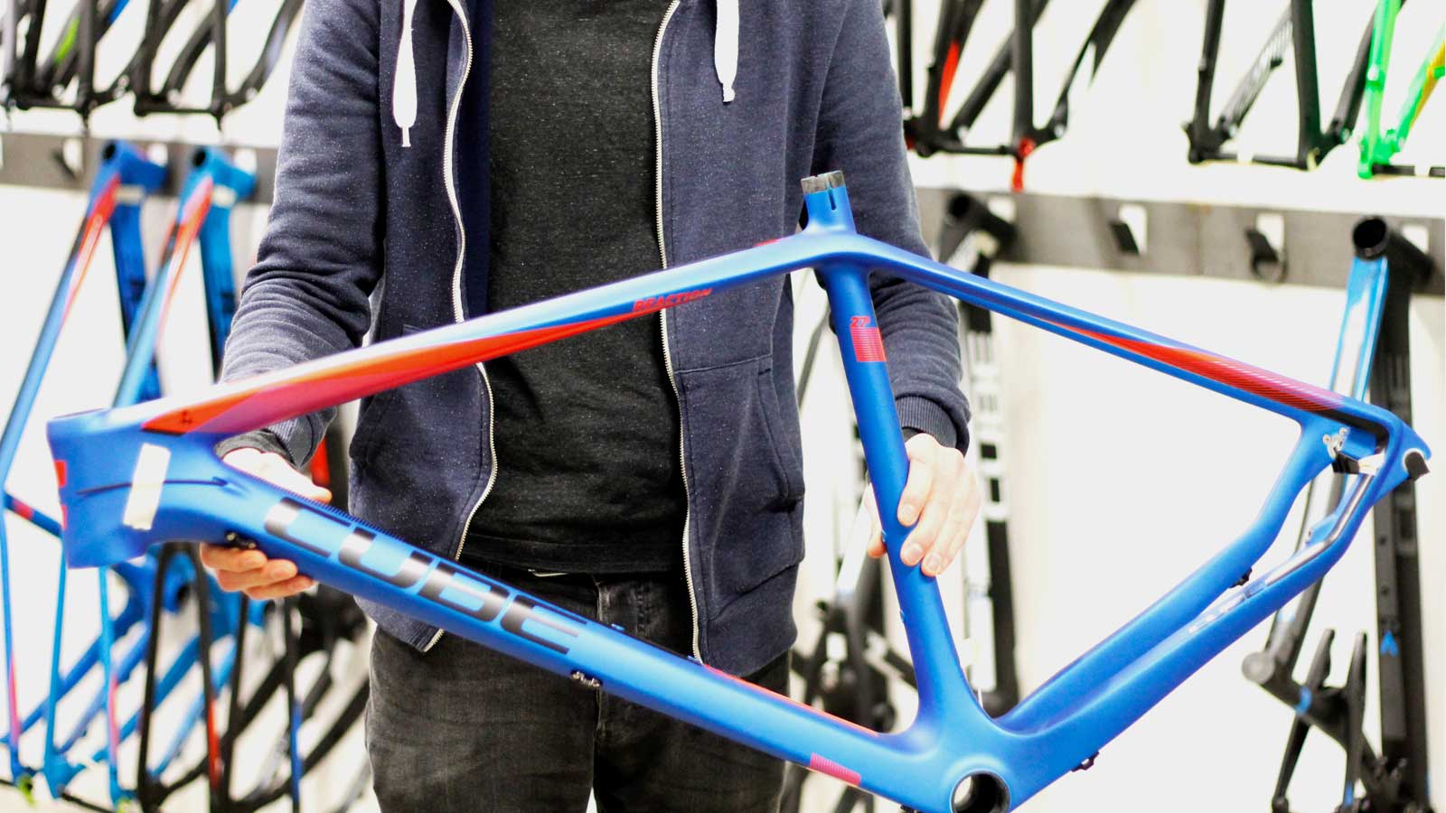
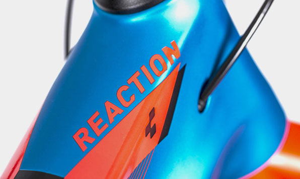
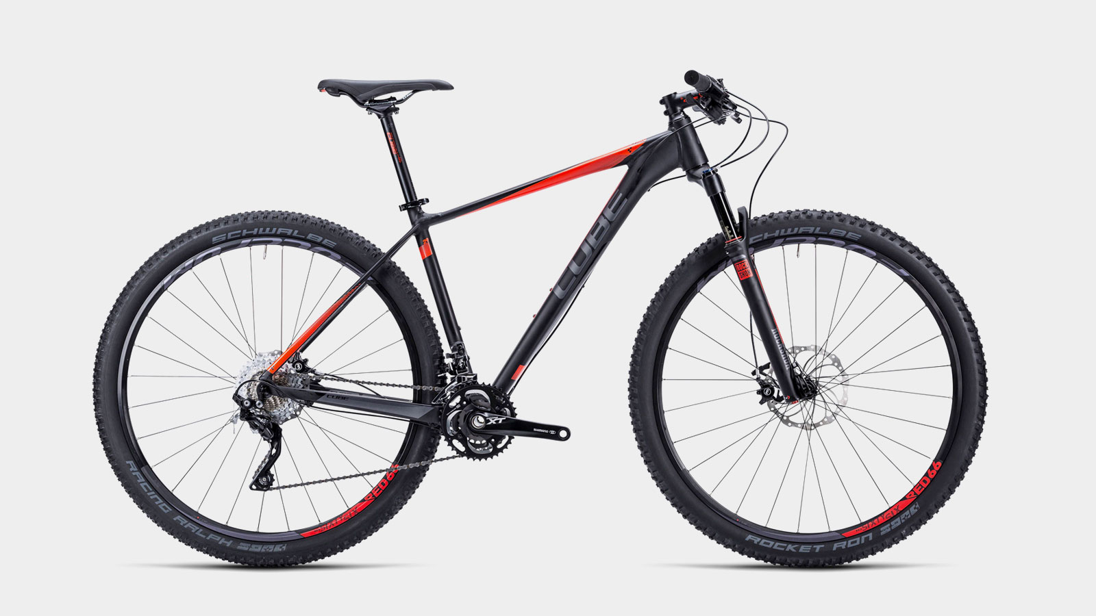
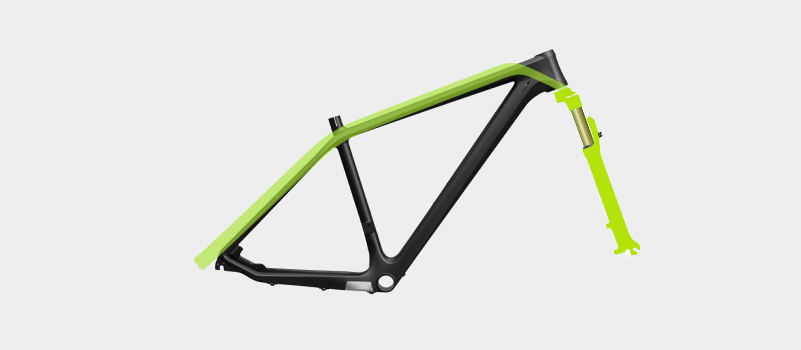
Carbon & Light & Shadow
Light and Shadow were emphasized at the models with valuable carbon. The line gradients set accents, convey dynamic, and highlight the frame form.
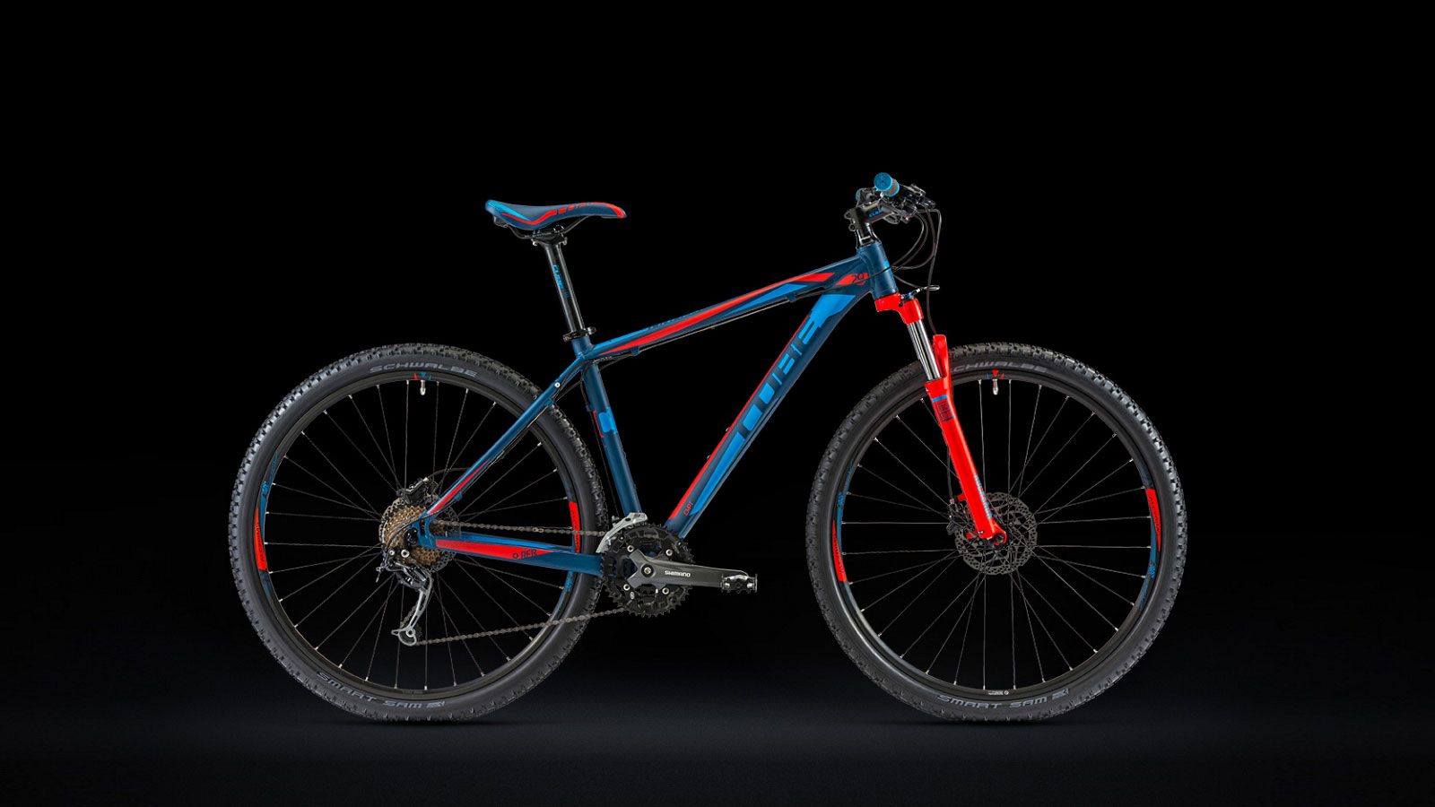
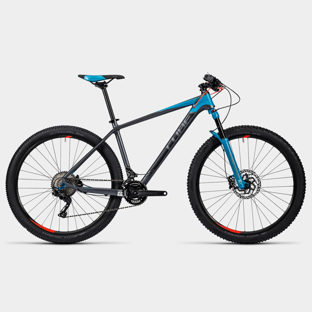
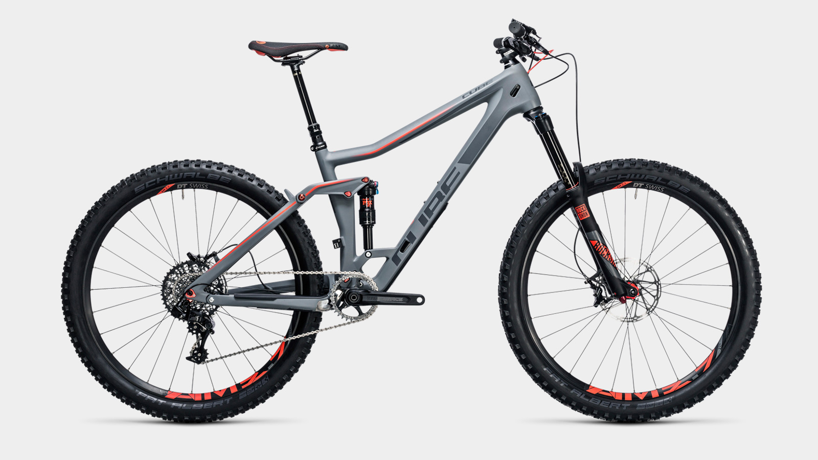
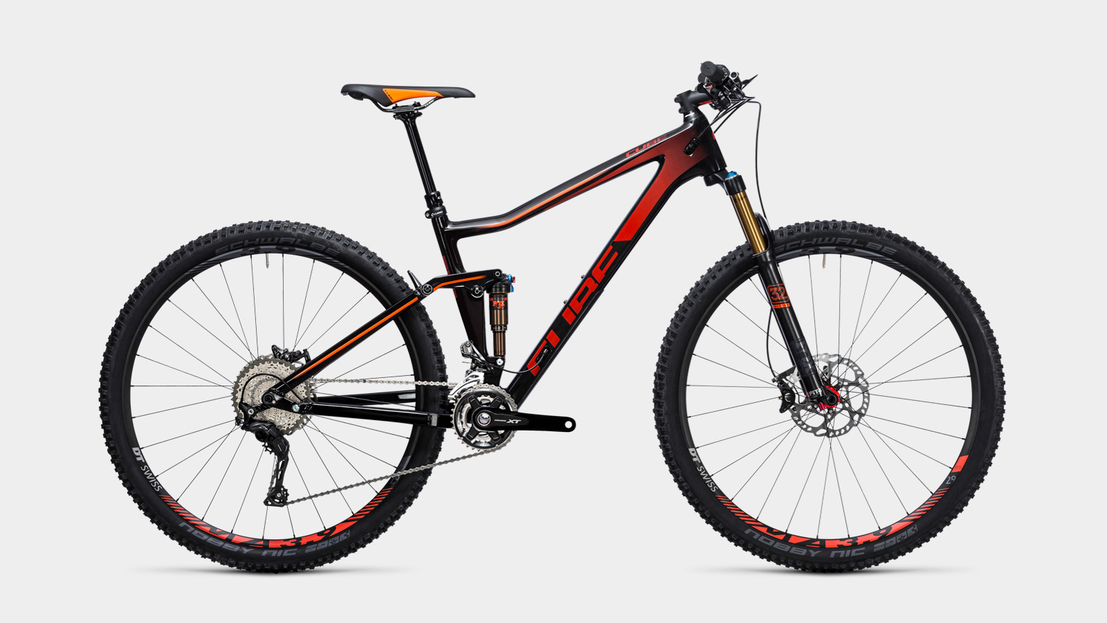
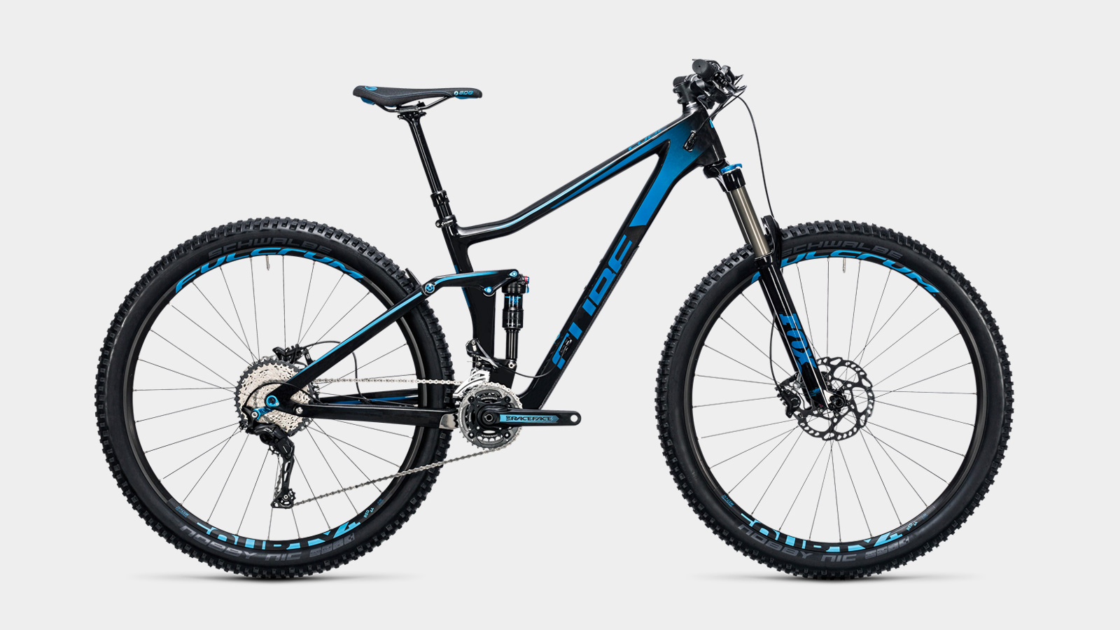
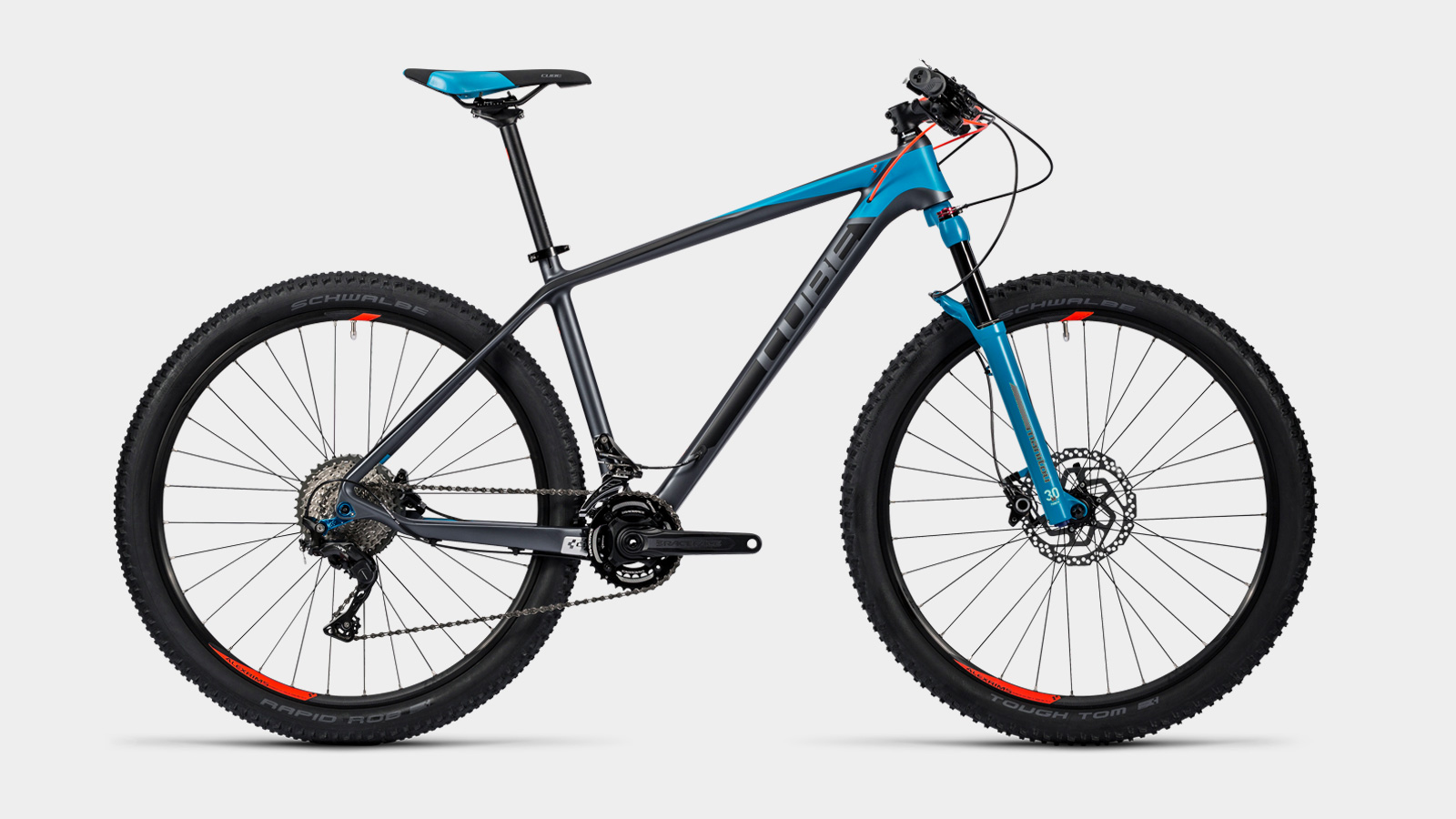
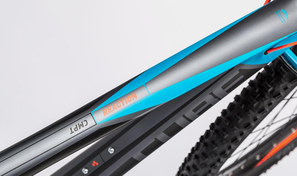
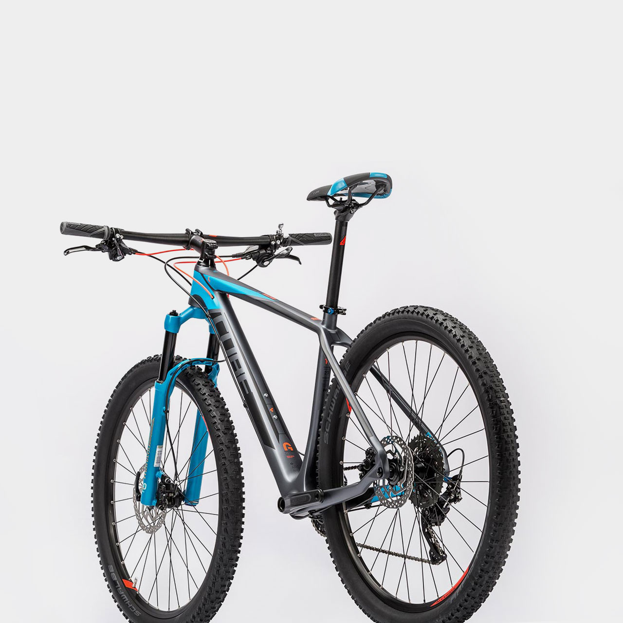
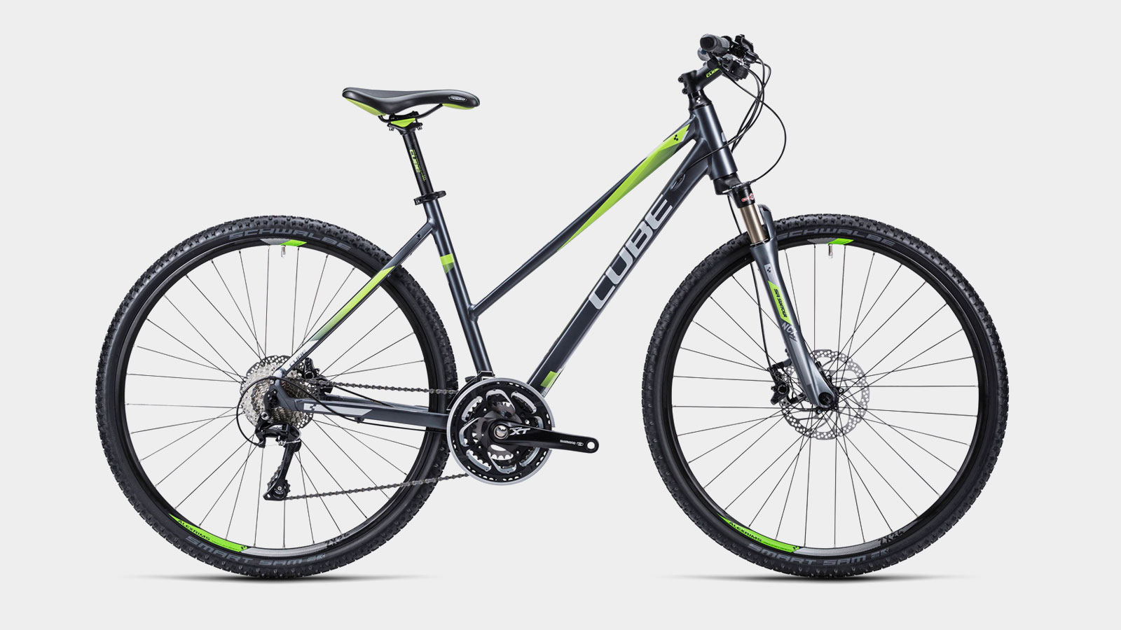
More bikes in Blur-Design

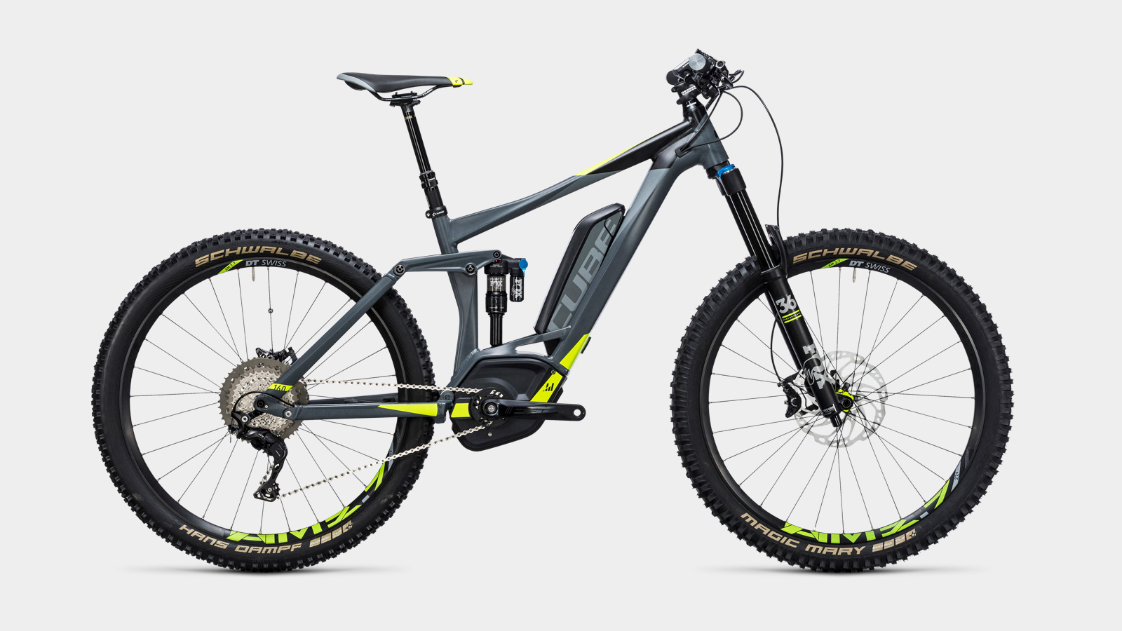
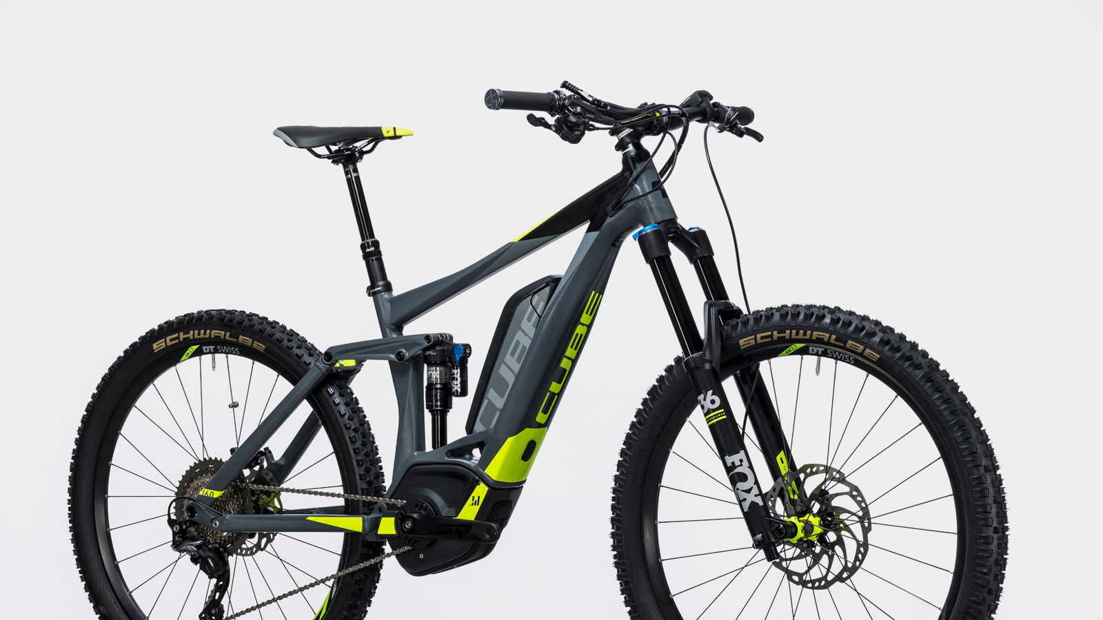


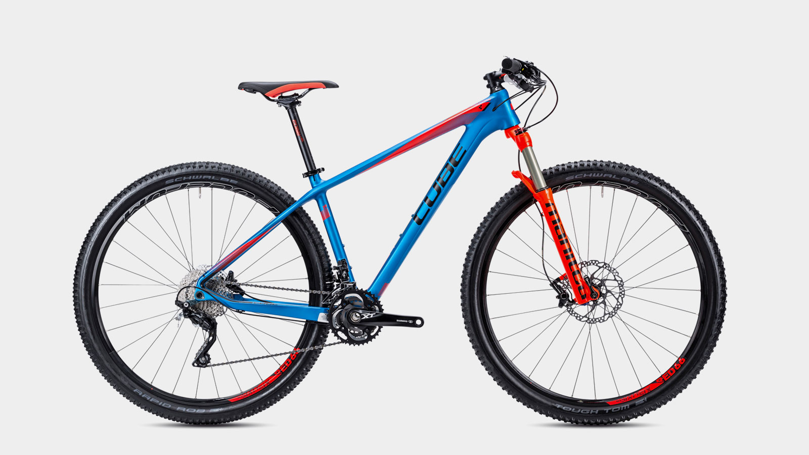
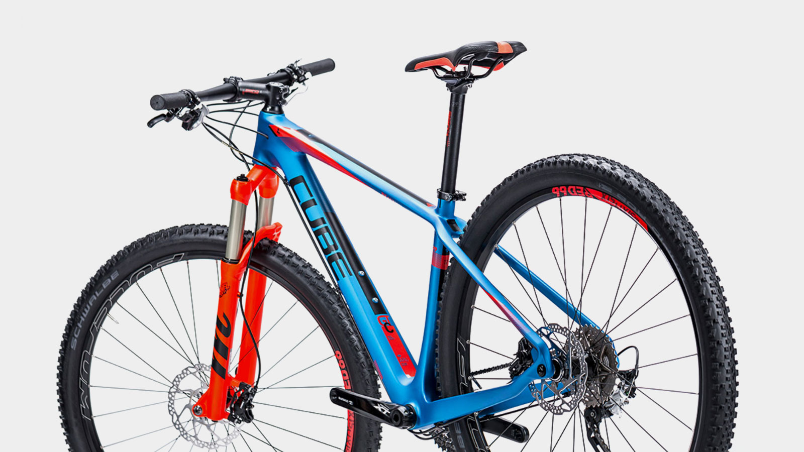
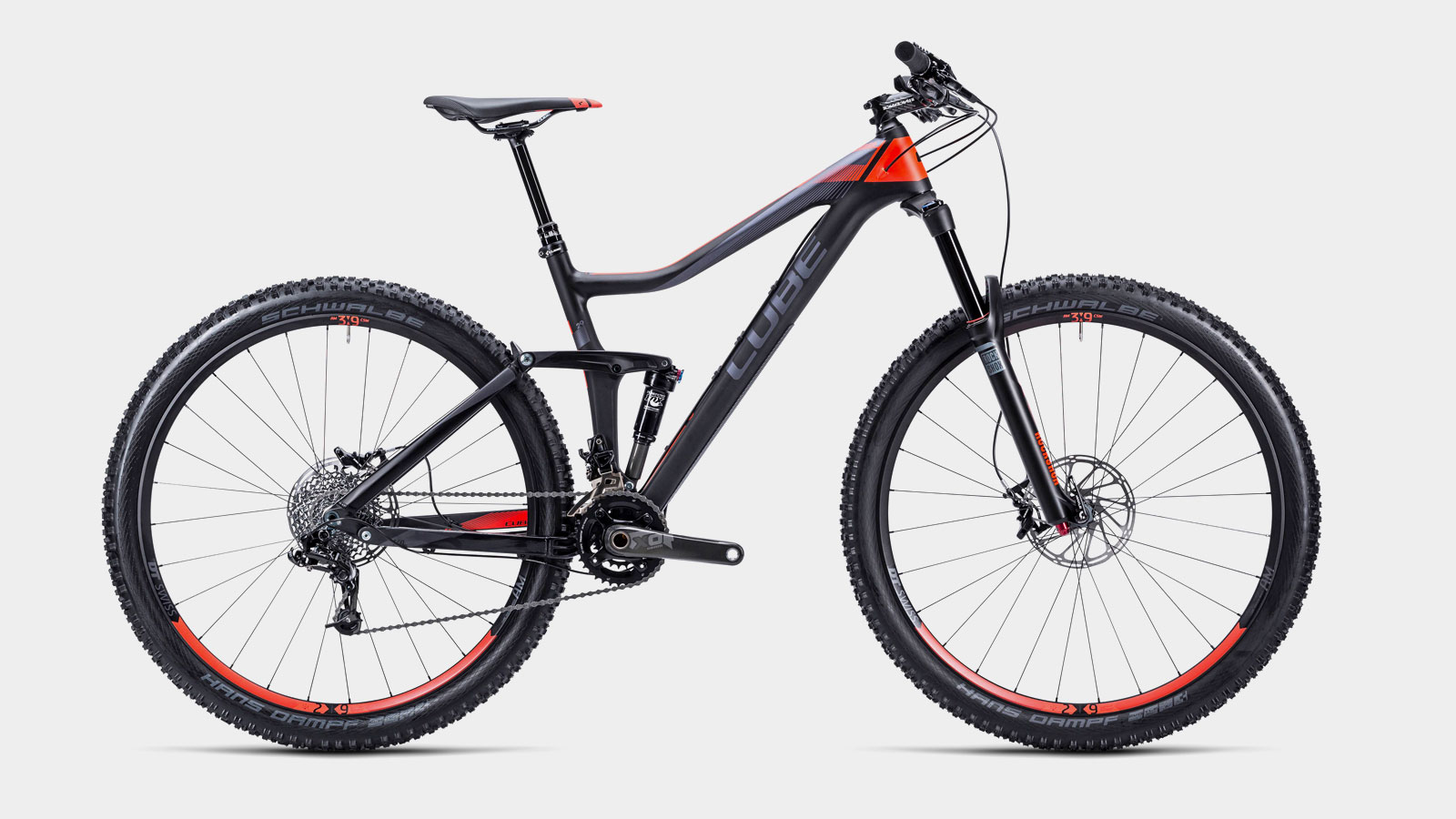
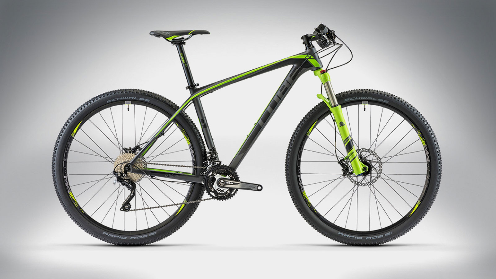
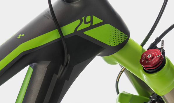
Edges for angular hydroforming – Aluminum
The edgy aluminum forms get intensified with edgy surfaces and provide differentiation possibilities through the alternating arrangements. For example, in the growing Cube E-Bike-Segment.
More bikes in Edge-Design
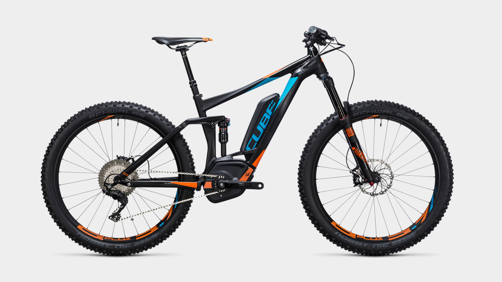
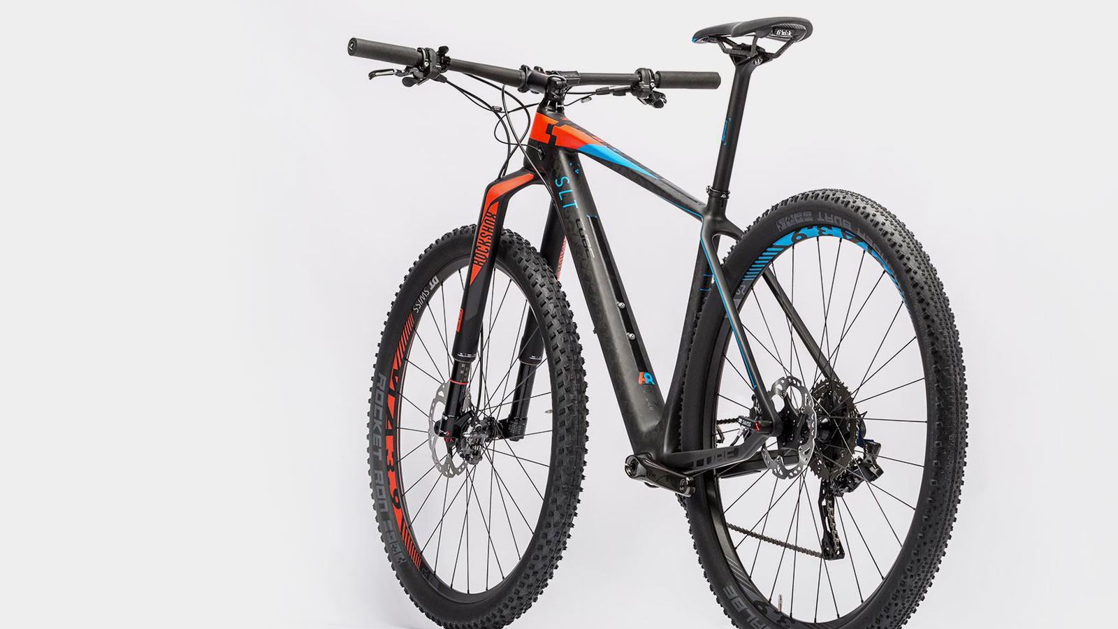
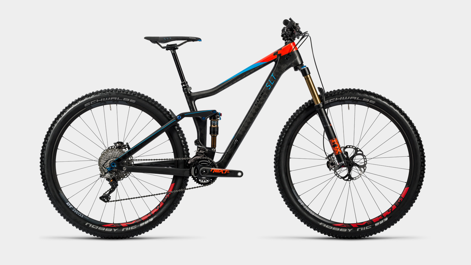
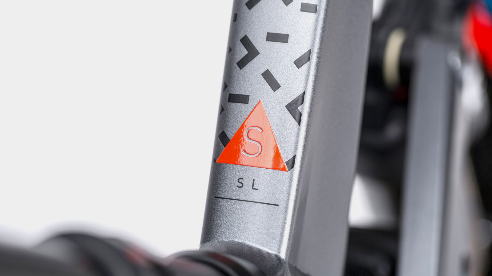
2016
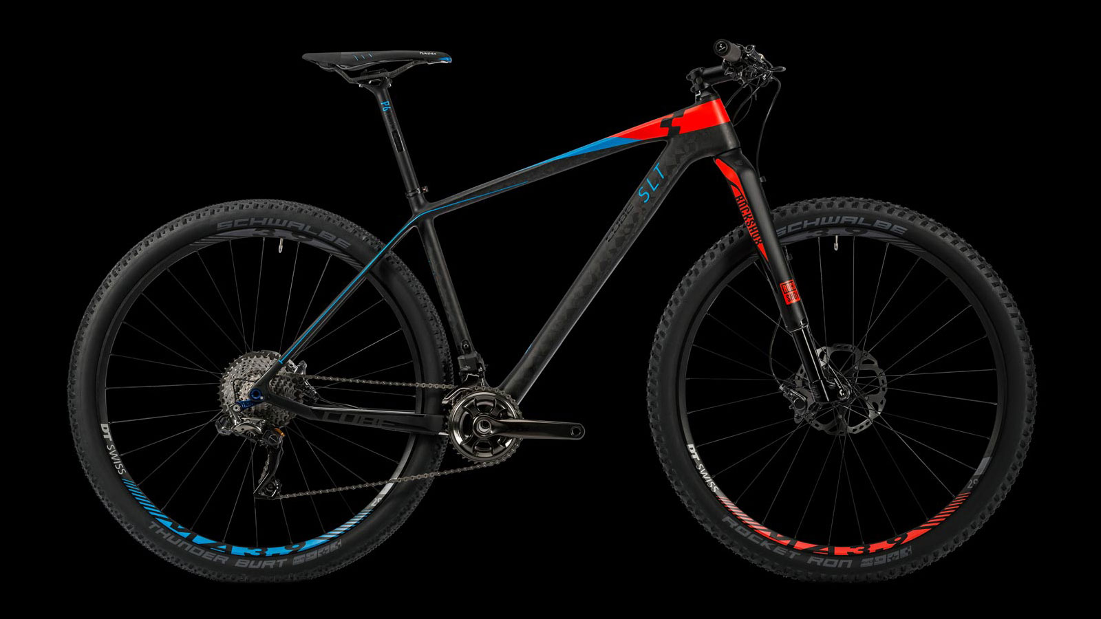
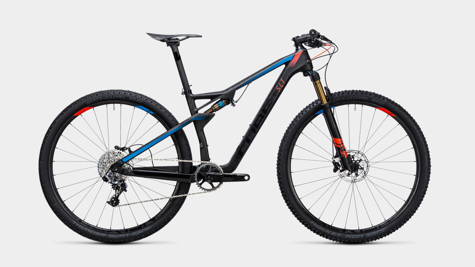
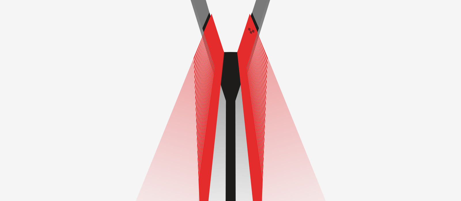
More bikes in SLT Front Color Cut Design
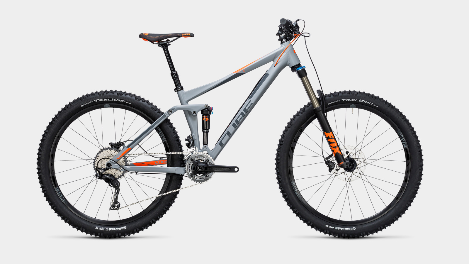
2015
More bikes in Overlap-Design
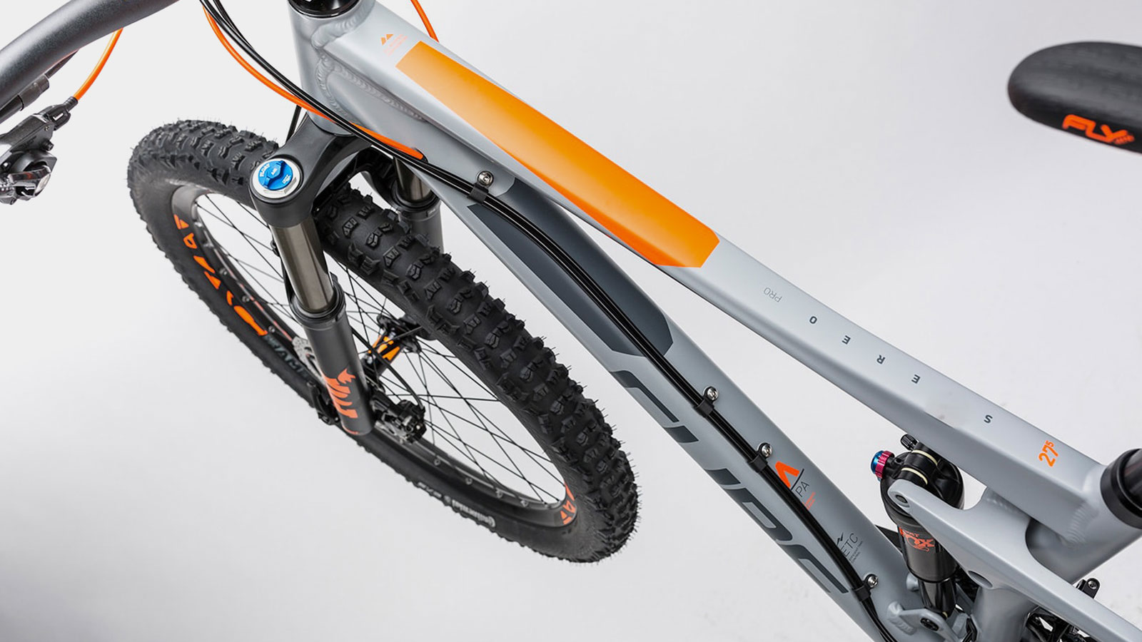
2014
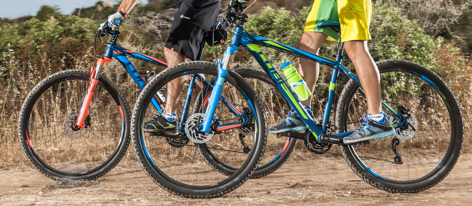
Color arc starting from the fork
The appearance of the complete bicycle is our focus. This also includes additional components – colored forks allow the 2014 collection to draw a dynamic line across the entire wheel.
More bikes in Color Arc Design