[nm_banner_slider arrows=”1″ pagination=”1″ infinite=”1″ animation=”fade” speed=”1000″ autoplay=”7000″][nm_banner title_size=”medium” text_position=”h_left-v_center” text_animation=”fadeIn” image_id=”2587″ alt_image_id=”3709″][nm_banner title_size=”medium” text_position=”h_left-v_center” text_animation=”fadeIn” image_id=”2585″ alt_image_id=”3711″][nm_banner title_size=”medium” text_position=”h_left-v_center” text_animation=”fadeIn” image_id=”2586″ alt_image_id=”3710″][/nm_banner_slider]
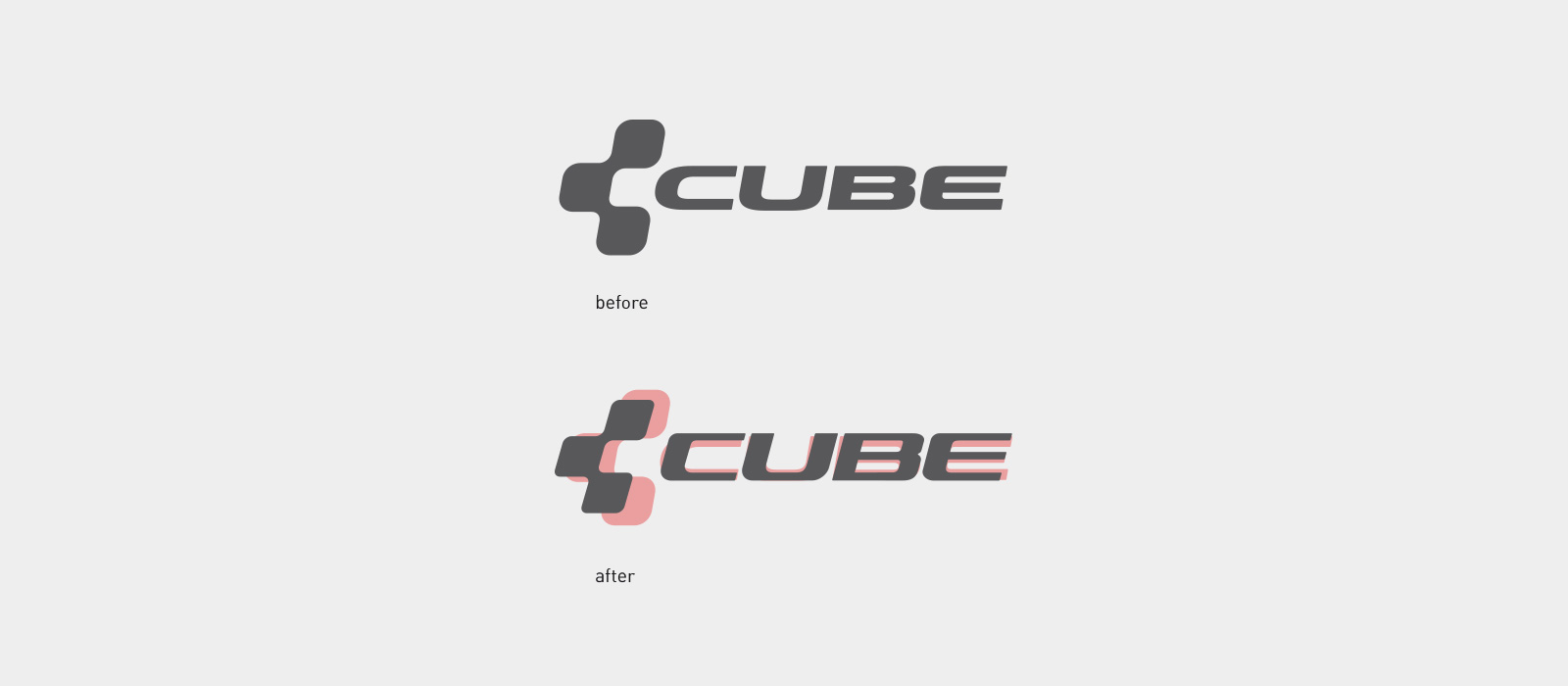
Cube Bikes Corporate – Logo Relaunch & Corporate Design.
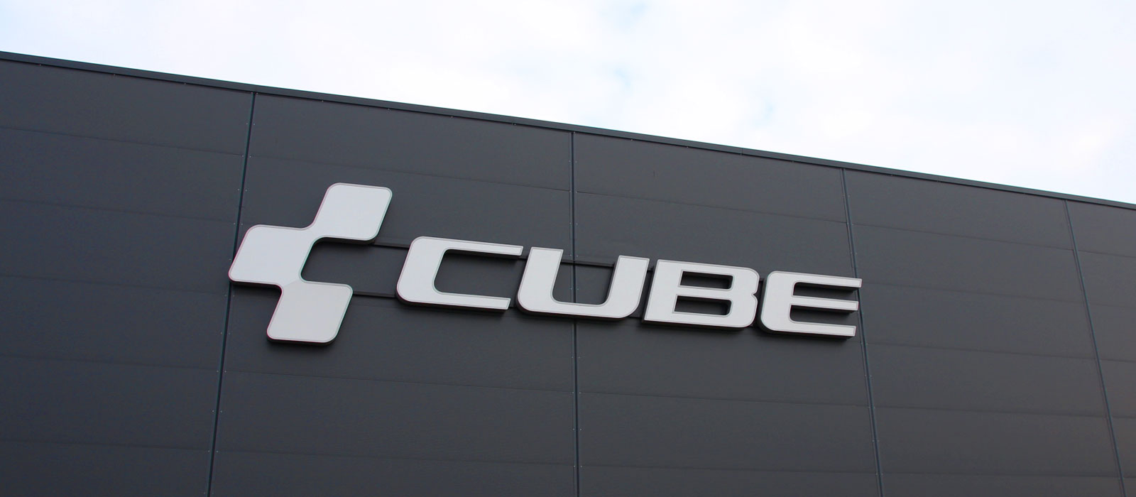
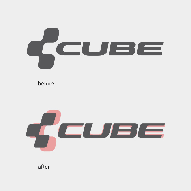
Cube’s slightly worn out Logo underwent a relaunch with us. It was supposed to be designed more dynamic and modern for the framework and many more purposes. As of now, the new word & figurative mark decorates all of Cube’s products – worldwide, from the framework over to air pumps, caps, all the way to the bike shops.
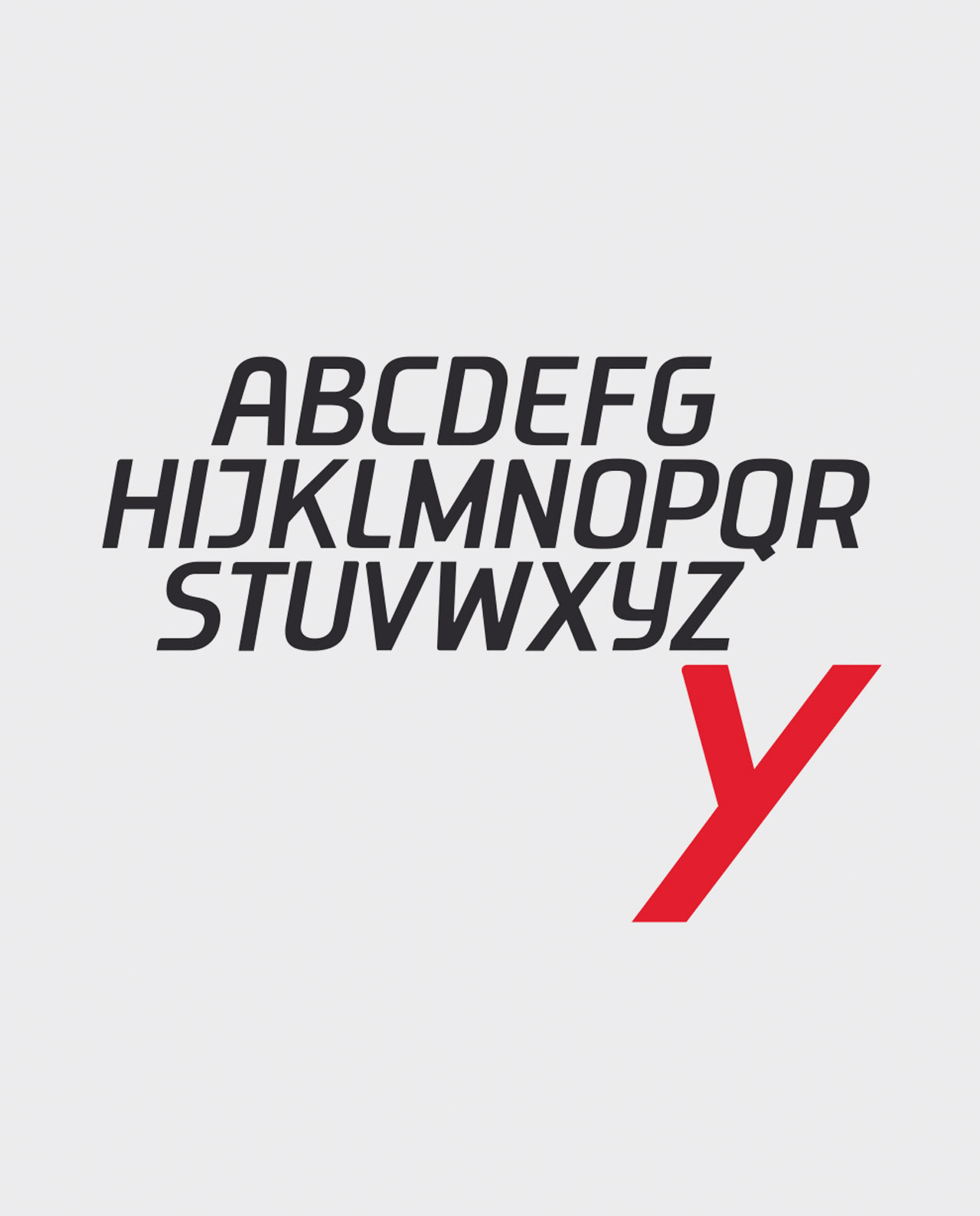
New Cube Condensed Medium Italic
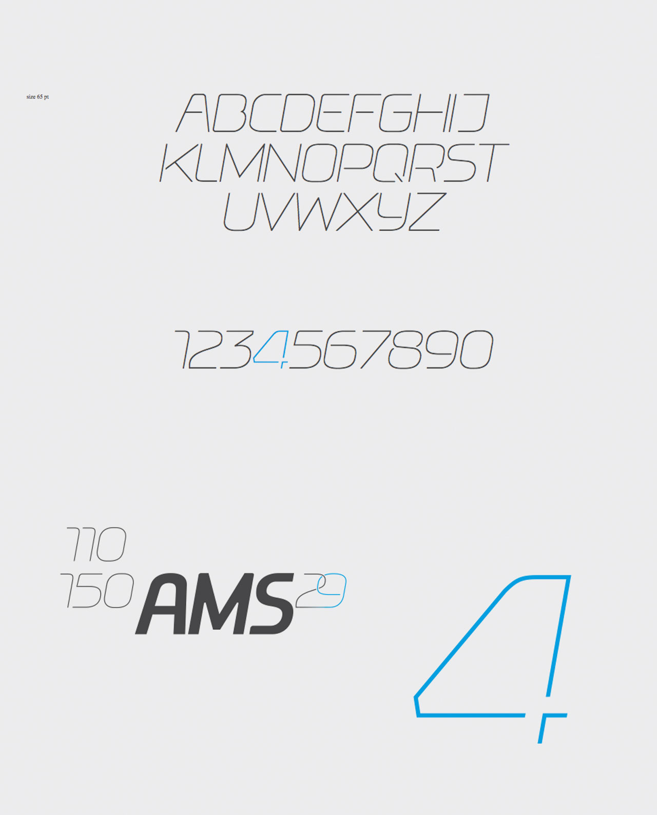
New Cube Light Italic